A Piece of Cake Designs A Piece of Cake Designs home FAQs view cart

Tuesday, 30 June 2015

Tutorial Tuesday - Anna Allan; She Dreams...


 Hiya everybody!
I'm back today with a 12x12" layout share, and I'm picking out a few elements of my page to explain further in how I went about creating it.

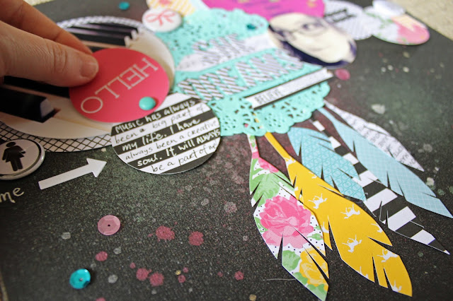
I am using the May Cupcake Kit and focused alot on the papers in this layout.


I chose a variety of papers from the range by Chickaniddy that was in the kit. Some I cut into circles of various sizes and others I cut into feathers to 'hang' from the doily.
I have used 2 photos and also a quote pic that I created using one of my fave apps on my iPhone - Rhonna Designs.


Here's how I did it...

1. Opened the app.
2. Selected the camera film icon which takes you to a menu with options to choose images from your camera roll, gallery albums etc OR choose a ready made background...which is what I did.
I chose the gold glitter background and clicked crop in the corner.

3. Select starburst icon in top left corner. A menu pops inwards and you select a design element you would like to add. I chose the triangle cut circle from 'Insta Rounds'. Enlarged it to size of square box, selected a colour (which I mixed by opting for 'more' colours) and pressed done.

4. Pressed the T button in top left hand corner and selected font.
5. Typed in the quote and then sized it to fill coloured circle. Chose a darker colour for the text so it stood out over the background colours. Pressed done.
6. Pressed the button in the top right corner and a menu pops inwards - choose SHARE and save to camera roll.

7. I printed it off 4x4" and cut the circle out which I have used here in the layout!


___________________________________________

 Continuing on with the page, I have also used two smaller circles, 'hello' punched from a cut-apart and the black and white stripe patterned paper, and attached them together with a split pin from the kit.


The 'hello' circle slides upwards to reveal the journalling underneath.


I have completed the layout by adding some extra touches from the kit contents - flair, sequins, stickers - and I also added a couple of extra APOCD flair from my stash.

And I called it DONE!


Thanks for dropping by!
Please do share your creations over at the APOCD Cafe on Facebook.
We all love seeing your work pop up and seeing discussions happening amongst fellow creatives.

Until next time...
Anna


Monday, 22 June 2015

MESSY MONDAY: Anna Allan; Embellish in Monochrome...


Hello APOCD friends.
I received my DT kit last week and I immediately started playing.
I was super keen to try out that Higgins black ink - so out it came, along with the paintbrush and off I went!

My background is all ink - brushstrokes and ink splatters.
Then all my embellishments are sticking to the black and white theme, with a splash of cream mixed throughout as well.


I've used the papers, stickers, alphas, and flair from the kit and have added some word/phrase stickers from my own stash. I've also added some stencil, whipped spackle, and cotton detail to my page as well.


I chose photos that stood out but stayed with the neutral colour scheme. These silly shots of my big girl being her crazy self were perfect and I love how they look against the monochrome background.
The title -- I mounted the diagonal letter stickers onto white cardstock and cut around them to add a border which, I felt, made them pop out from the background more.

I thoroughly enjoyed creating this layout.
I hope you enjoyed seeing it!

Until next time...

Anna


Friday, 5 June 2015

FRIDAY FAVES - Anna Allan; Glorious Mud


Hello APOCD friends.
I'm back again today to share another layout using the April Main Cake Kit.

I do love some layering.
I also love stitching on layouts. I don't do it often enough - I think sometimes I get preoccupied (or lazy) and don't make it around to the sewing machine.
But alas, I did with this layout. I love the clean border it makes.


I have chosen the more earthy toned patterned papers to go with the 'mud' theme and then girled it up with the splashes of pink.


And one of my most fave things to do to a layout is add ink splatters.
Despite creating a clean, clustered page, I just can't help myself and HAVE to splat away...just a little bit to give it some edge!
What's one of your favourite techniques or design elements you like when creating a layout?


Thanks for dropping by.

Anna :-)


Monday, 1 June 2015

MESSY MONDAY - Anna Allan; I AM...


Hello!
So...I pulled out my cupcake kit for April and before I knew it - I had misted, texture pasted, inked and scribbled my way to completing a layout.
No pre-conceived ideas or expectations as to how I wanted it to look - just free play!!
And so I thought that I would share it here...


I used the stencil to add texture to my background. When dry, I randomly dabbed the distress ink over parts of it.
I cut into a couple of the 6x6" patterned papers and placed them either side of my photo atop a ripped piece of tissue paper from my stash. I like how the ripped edges make it look more grungy. 
And to grunge it up even more, I got out my .08 precision pen and got scribbling, circling, underlining etc etc.


 I used my journalling to create a border for my page.
It's so fun just to let go and just create.


Thanks for dropping by.

Anna :-)


A Piece of Cake Designs Blog, All Rights Reserved
Blog Theme by Mod Melon Creative